Actor Kritika Kamra’s Mumbai rental apartment celebrates Indian textiles
Filled with pieces that tell the actor’ story, interior designer Purva Agrawal styles a serene rental apartment that embraces Kamra’s love for Indian textiles and artisanship with a global, modern point of view.

Upon entering actor Kritika Kamra’s Mumbai rental apartment, one is immediately enveloped by an atmosphere of subtle sophistication and relaxed charm. Collaborating with interior designer Purva Agrawal, Kritika has curated an oasis in the bustling cityscape, reflecting her personal aesthetic while providing a chic setting for social gatherings or creative endeavors. “As an actor, I wanted my home to be a sanctuary devoid of posters and vanity lights. Spending ample time on sets, I craved a space that exudes homely warmth. Here, you won’t find the typical traces of my profession,” Kamra shares.
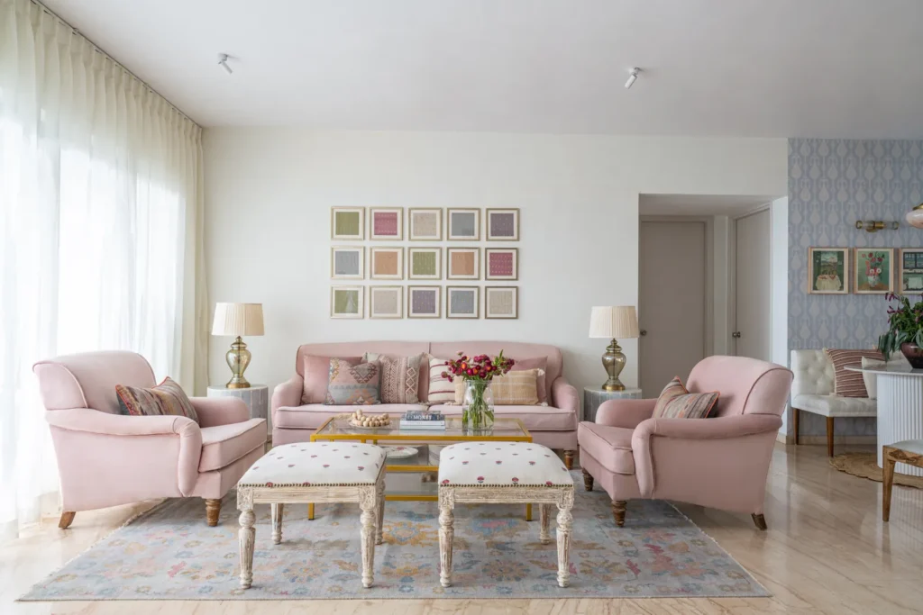
To add dimension and depth while defining a focal point in this living room, a grid wall framing textiles from Cinnabar (Kamra’s label of Chanderi textiles) were hand-dyed to match the colour palette of the room. Intent on designing a feminine and charming space, Agrawal continued the pastel colour palette from the dining area with velvet blush pink seating and muted blue bone inlay side tables. The gold framed coffee table and floral motif pouffes make an eclectic mix of vintage and modern, adding just the right touch of elegance and luxury, while the grey-toned multicolour rug from Knotty Rugs helps ground this section of the room. Kuber Shah
“Her initial contact came through Instagram,” Agrawal recalls enthusiastically when recounting her first interaction with Kamra. “She expressed her desire to revamp her home, and the before-and-after transformations I showcased for rental properties, all without structural changes, resonated with her.” While specializing in rental home design wasn’t initially her plan, Agrawal notes being approached by individuals who had leased their spaces for extended periods, seeking to infuse their dwellings with a sense of personalization and ownership. “It’s quite a commitment to reside in a space that doesn’t reflect your personality or taste for years,” she adds.
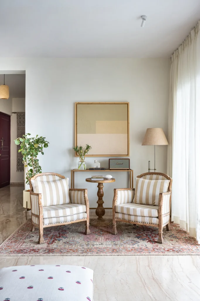
A palette of beige and white in the living room creates a sense of balance and harmony. “We used light distressed vintage furniture, accented by a gold framed console and a beautiful textured art piece from Hue Studio, and tied it together with a multicoloured rug from Jaipur Rugs. A serene space in the home where Kritika relaxes while enjoying a cup of tea,” shares Agrawal.Kuber Shah
“This isn’t my childhood home—my parents aren’t living with me—and I understand that this isn’t a permanent residence. To me, this is my home for my 30s. That’s what I conveyed to Purva—I want this to be the home of my 30s,” Kamra reveals about the apartment she’s rented for a few years. “I realized this place offered ample space for me. It receives wonderful natural light, it’s situated on a higher floor, and it’s conveniently located for all my shoots and appointments. I didn’t want to leave the apartment, but I wanted to give it a fresh feel—more like a true home.” As an actress, not inclined to adorn her home with headshots and film posters, she instructed Purva to design something contemporary and multifaceted. She also wanted to incorporate textiles from Cinnabar, the handloom brand she launched during the lockdown to honor India’s rich weaving traditions.
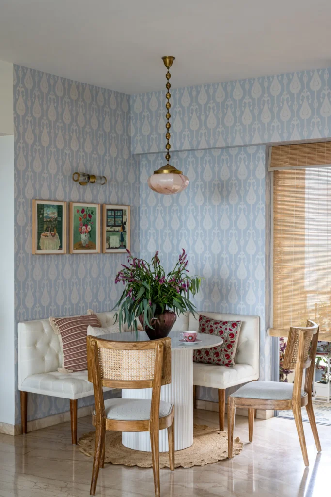
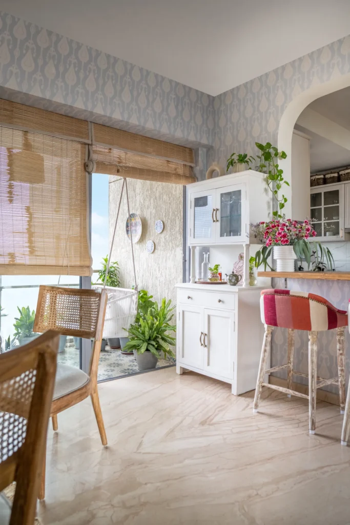
“Whether it’s a cup of coffee for yourself or an intimate meal with your family, a cosy dining nook is an incredible addition to any home. With calming ikat wallpaper from Metamorph and eye-catching artwork, which helps separate the space from the rest of the room, this nook is one of our favourite corners of this home makeover. We enjoyed contrasting the pastel blue wall with neutral furniture, such as an ivory bench, a custom-made fluted marble round dining table and rattan upholstered chairs. This dining area is highlighted by a vintage Art Deco pink marble pendant light from The Hesperus Store that completely elevates this space, making it appear elegant and charming.”
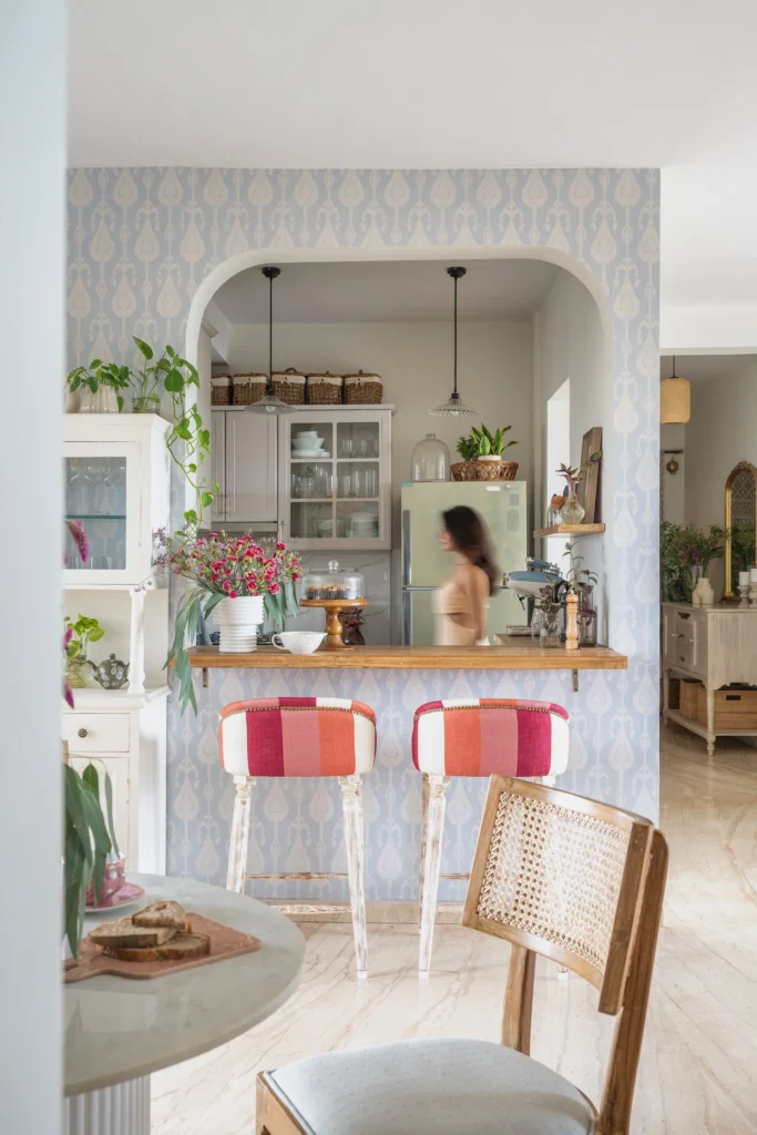
By expanding an already existing window between the kitchen and the dining area, and adding a subtle arch, a space was created for a relaxed morning coffee. A set of custom-made red and orange bar chairs bring in a pop of colour; while the bar cabinet adds additional storage for glassware. Kuber Shah
“The house was already well-designed when I first saw it, and I could immediately sense Kritika’s personality reflected in the decor and the layout of the space. However, there were a few aspects we needed to address, such as creating larger wardrobe spaces and achieving a fresher, more open ambiance with tasteful colors… Kritika particularly desired a change of scenery in her home,” explains Agrawal, detailing Kamra’s vision for a relaxed, European cottage-style atmosphere using a muted neutral palette. Additionally, she needed the home to provide versatile spaces where she could shoot content for her digital platforms in various nooks and corners.
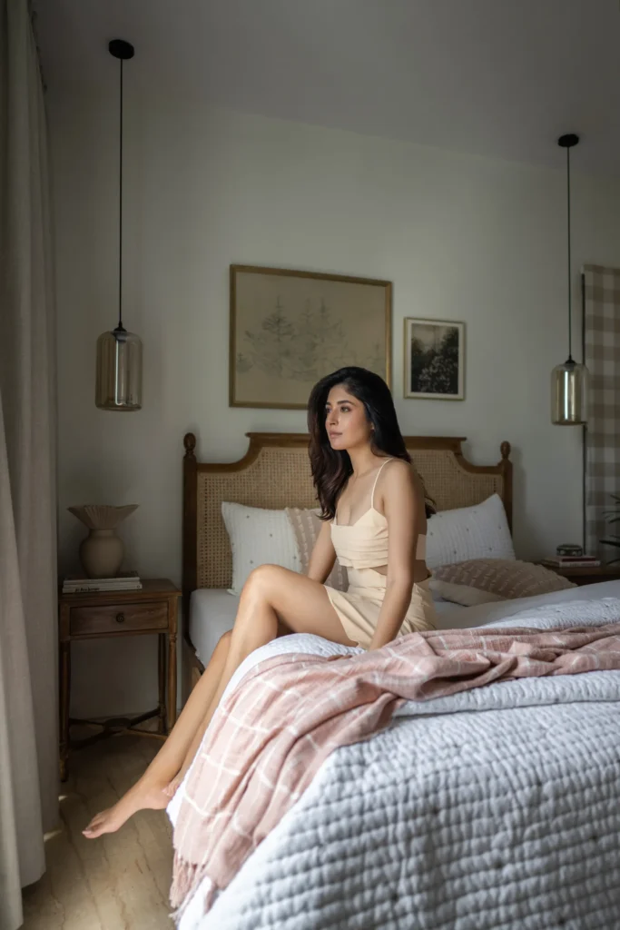
“Purva and I both have a passion for fashion—she pursued formal education in it, while I chose to pursue acting!” Kamra chuckles. “She understood my appreciation for Indian textiles and handmade items, especially since my hometown is close to Chanderi,” she explains, gesturing to the unique ikat wallpaper in her dining room. Agrawal also curated a grid featuring dyed swatches from Cinnabar’s Chanderi fabrics, showcasing different motifs from each sari, complemented by suzani cushions and kilims adorning the walls. “The challenge was to avoid it looking like a store in any way,” Kamra notes, referring to her three-bedroom apartment—one serving as her bedroom, another for guests, and the third as a media room housing her art collection and doubling as a shooting space.
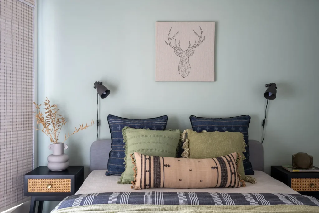
The guest bedroom is styled to be a cosy minimalist sanctuary with a mint blue wall, enhanced by muted blue and green bedding. The geometric lined art piece makes the room appear cohesive without making it look cluttered. Kuber Shah
“I usually have clients fill out a brief questionnaire to better understand their preferences, but Kritika didn’t fill hers out!” Agrawal chuckles. “However, it was clear that she wanted to create a more open space, introduce additional seating, transform the living room into an entertaining area, and open up the kitchen—where we added a bar counter.” Kamra highlights how this has provided her with ample space for entertaining, stating, “There’s so much room to lay out food, mix drinks, set up a grazing table, or have guests sit down and eat.”
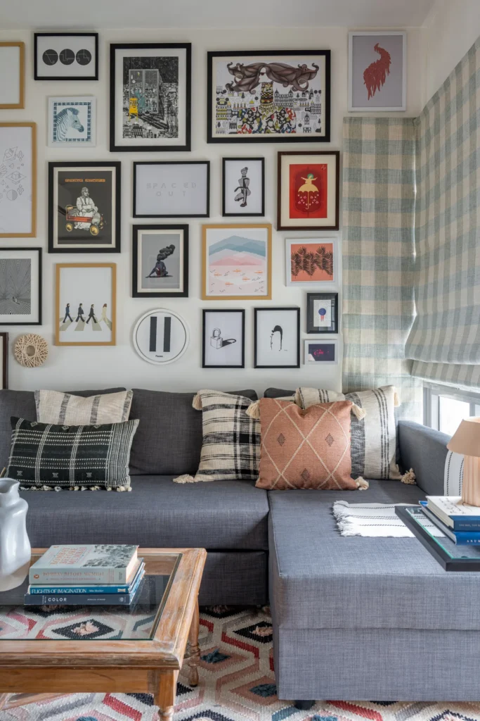
The media room is a multifunctional vibrant space with a collection wall displaying eclectic art prints that are complemented by a mix of chequered and geometric patterns. Kuber Shah
In renovating this Mumbai rental apartment, the focus was on clever tricks to enhance the space, such as updating the kitchen cabinet fronts, rearranging the layout, and reupholstering the furniture. The only major civil work involved was changing the tiles on the balcony, which Kritika desired to transform into a relaxing retreat. She explains, “It was a very big space, and the original tiles weren’t visually appealing.”
Their primary takeaway from renovating a rental home? Avoid overspending on items that can’t be taken to the next space. “Even if you invest in permanent fixtures, there are high-quality pieces and materials available in the market at affordable prices,” they advise.


